
Neha, 24
“Will checking my score lower it? I don’t even know where to start.”
Goals
- Understand what a credit score is
- Get her first report without hassle
Frustrations
- Jargon-heavy reports
- Unsure what’s free and what’s paid
Rethinking how people check, understand and fix their credit with one of India’s four credit bureaus, from the first visit to a dispute. Built for web and mobile, and as a white-label portal banks can ship under their own brand.


Derived personas from the UX approach, shaped by benchmarking CIBIL, Experian, Equifax and global players like Credit Karma.
“Will checking my score lower it? I don’t even know where to start.”
“My loan was rejected and nobody told me why.”
“I’m paying for this. Show me what will actually move my score.”
“I want insights for my situation, not tips written for everyone.”
CRIF High Mark’s consumer portal read like a bureau file: dense tables, little explanation, and a sign-in that leaned on details many people couldn’t recall. Users arrived with one question, “why is my score what it is, and what can I do about it?”, and rarely left with an answer. The brief was a full rethink of the consumer journey, from pre-login to disputes, on web and mobile, plus a version partner banks could rebrand as their own.
What we heard most
Numbers without reasons
Stuck at identity checks
Plans that were hard to compare
Pre-login shows what a score means, how the portal helps and what each plan unlocks, before asking for a phone number.
Every number on the dashboard carries the reason behind it and the next best action, in plain language.
Colours, buttons and logo map to a handful of tokens, so a lender can launch the same portal as its own.
IA feature mapping started from the jobs on the personas’ minds: see my score, understand it, change it, protect it. Report, simulator, alerts and plans became top-level tabs; sign-in, disputes and profile sit around them.
Top nav: Dashboard · My Report · Score Simulator · Alerts · Plans
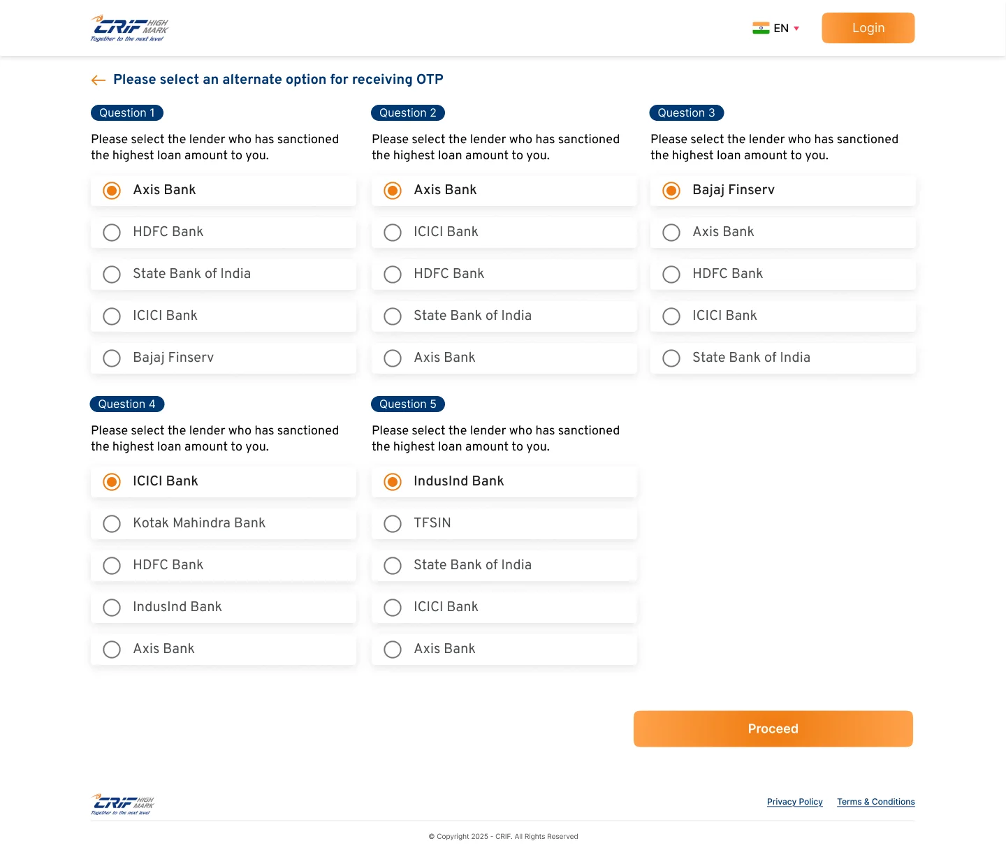
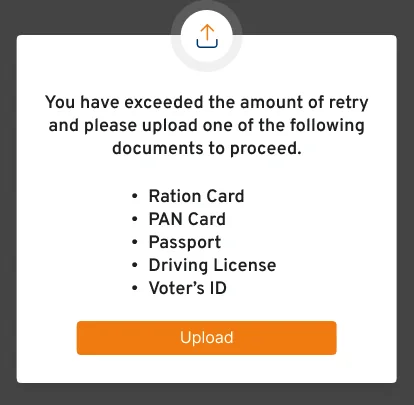
Bureau sign-ins depend on the phone number lenders have on file, and that isn’t always current. We designed a fallback ladder: an alternate number or email, then five questions only the real person can answer from their credit history (CRQ), and finally an ID upload, so nobody hits a dead end.


Five questions from your own credit history. Fewer than four right? Retry, then upload an ID.
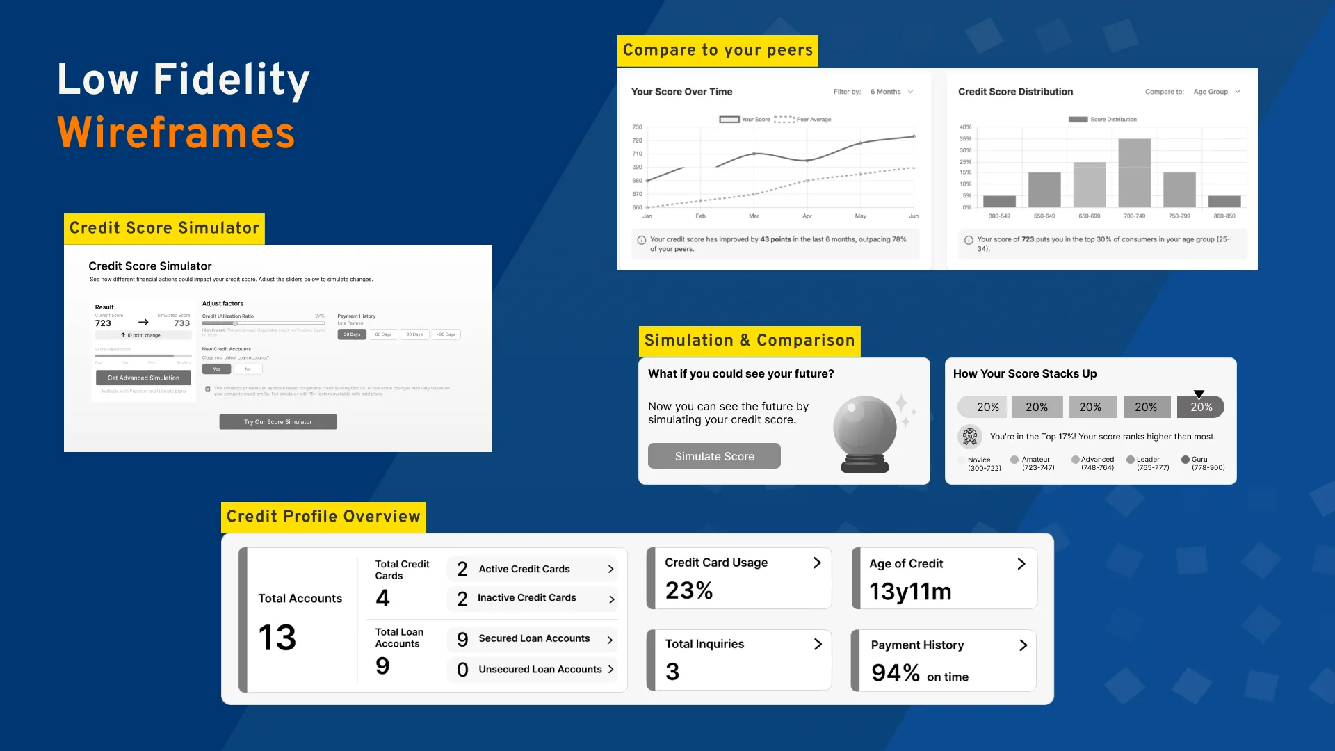
Before any UI, we tested ideas in grey: score versus report, a crystal-ball simulator, peer comparison bands from Novice to Guru, and a credit-profile overview. Plan pricing went through two layouts before we settled on side-by-side cards.

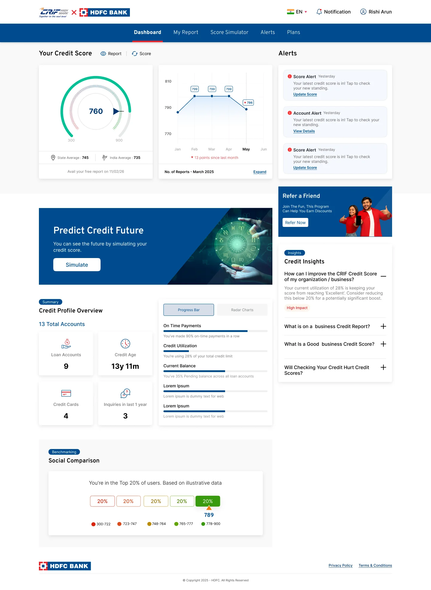
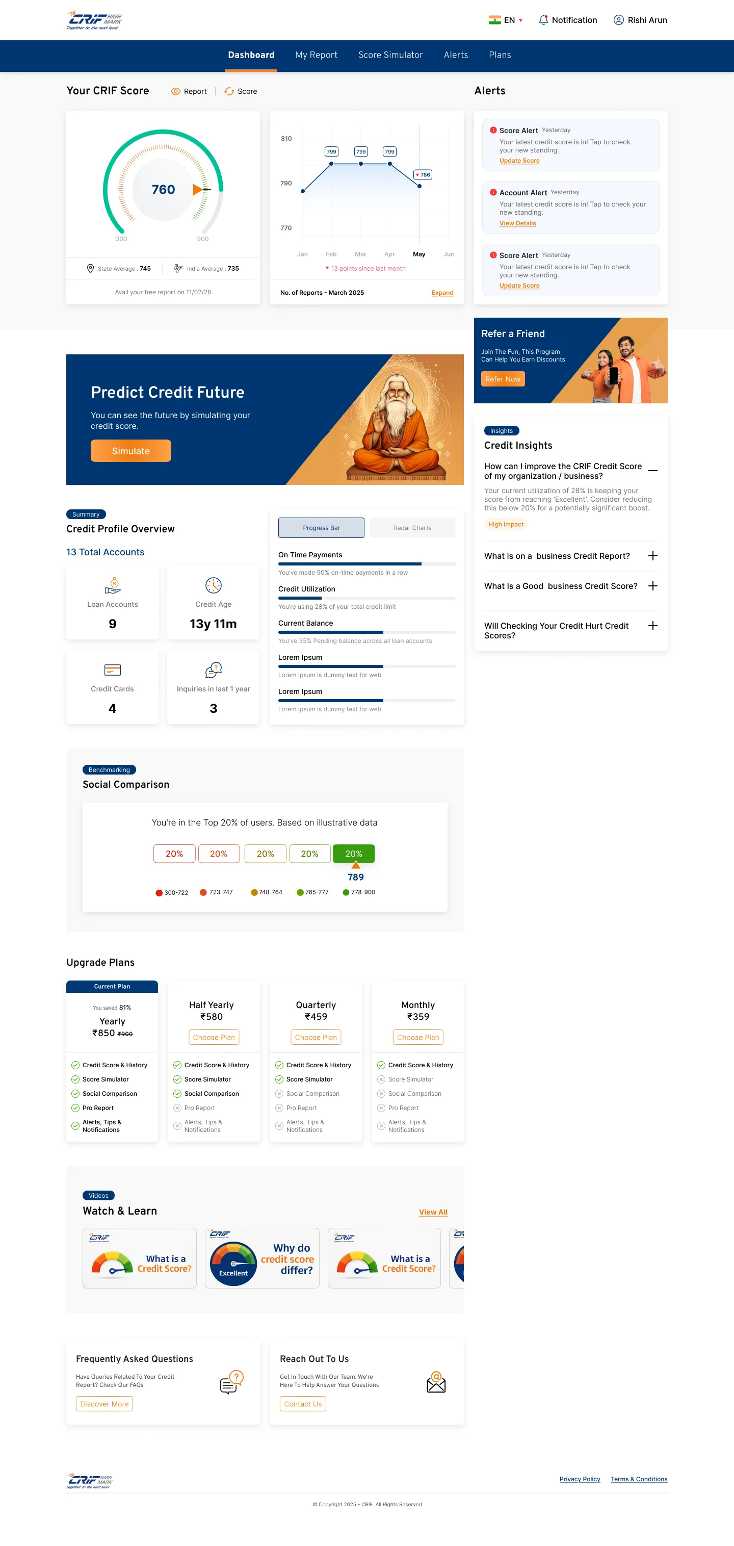
Score, trend and alerts sit above the fold. Below, credit-profile cards and plain-language insights show what’s helping, what’s hurting and the one change with the biggest impact.

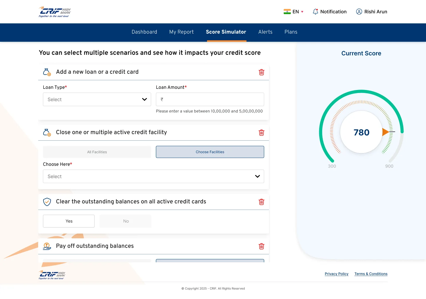
Pick one or more scenarios, like a new loan, closing a card, paying off a balance or a late payment, and watch the score dial move before committing to anything.

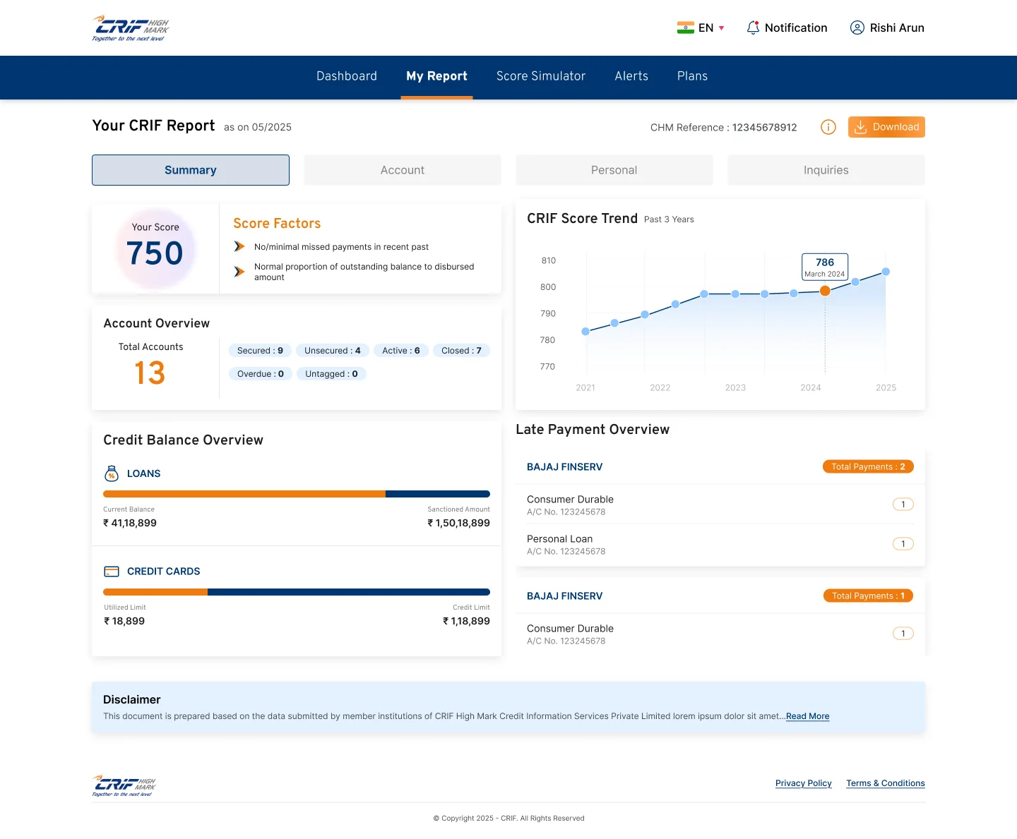
Summary first: score factors, account overview, balances and late payments. Tabs for accounts, personal details and enquiries are there when you want the full file.

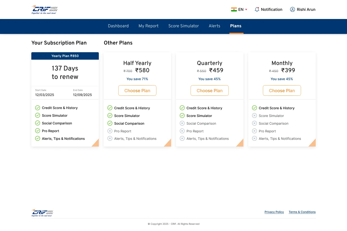
Your current plan and days to renew on the left; every other plan side by side, with savings and a clear tick list of what each unlocks.

The white-label system was mine. Every colour on the portal maps to a small set of tokens: primary, secondary, primary-button and secondary-button colours, plus the brand logo. A partner bank swaps those, and ships CRIF’s portal under its own name without a single new screen.

CIBIL, Experian and Equifax locally; Credit Karma, Credit Sesame and Aura globally.
Four derived personas, from first-timers to advanced users.
IA feature mapping, key pillars and UX laws: Jakob’s, proximity, serial position.
Wireframes for simulator, comparison and plans, then final web and mobile UI.
A white-label kit for banks, and the same framework extended to a Loans module.
Pre-login, sign-in with the CRQ fallback, dashboard, report, simulator, plans, disputes and profile were delivered as one consistent journey on web and mobile, alongside a white-label kit partner banks can theme. These are the signals we set up to judge it.
Sign-ins completed via OTP, alternate contact or CRQ, and how many reach the ID upload.
Movement from the free report to a monthly, quarterly or yearly plan.
How often people run scenarios, and which ones, before applying for credit.
Disputes raised and tracked in the portal instead of through support.